Wednesday, 30 September 2009

Digital Photograms - Colour


For this set of digital photo grams I am going to use colour instead of monochrome. The image below is the image I am going to start with.


I then clicked invert colours to see what it would turn out to look like before doing anything else to the image. I liked the way it came out as it is abstract and different.
Another way to change the colour of a photo gram is to move the saturation all the way to the left to 0. This makes the image black and white. Then you click the colourise box under hue and saturation then you change hue until the picture is a colour you like. Below I did yellow to give the picture a washed out black and white look.


Digital Photograms - Monochrome

To start with i opened an image that i thought would look good in monochrome. I looked for a photo that had lots of dark and light parts. This i knew would give a better monochrome image as it would stand out more. In the photo i chose the bright light makes a lot of contrast.

I then needed to make my photo unsaturated. I did this by sliding the saturation on the "hue/saturation" tool bar all the way to 0. This gave me a grey scale positive. The screen shot below shows the steps above.

I then pressed the invert colour button, which swaps the tones around, for example, black became white and white became black. This leaves the photo in the form of a negative. It is now a digital photogram.

I like the effect it gives as it intensifies my personal experience. The different shades get darker towards the stage and on the side screen. This effect has also added vignetting though it gets lighter on the edges instead of darker. This effect is similar to that of Henry Fox Talbot and Man Ray.

David LaChapelle

LaChapelle is a credited photographer specialising in comic portraits of celebrities. He has four published photo-books which include portraits of Marylon Manson, Naomi Campbell, David Beckham, Angelina Jolie, Pamela Anderson, etc. His portraits are vivid and surreal and usually convey irony. His work has been criticized for being over exaggerated, grotesque and shocking.
Personally I think his work is good because in some cases his work portrays what the public really feel about the celebrities. The use of colour in his work is very important as the colour can change the meaning of his photo. He doesn’t use bright colours sparingly which gives the photo a good mood. I enjoy looking at his photos as they are sarcastic and different.

Tuesday, 29 September 2009

Feedback #1 Term 1

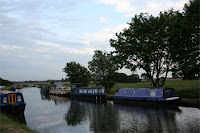
Well done Julian, This is a very detailed record of your stages of development with accurate technical terminology. I particularly liked the work on the Liverpool image and canal barge.

Colourise Tool

The colourise tool can be used to change all of the tones of the whole or part of an image to one colour. I did this now for various colours to show the effect. My original image is a sunset and is already an orangy colour. The original is below:
Below is a screen shot of how I achieved it.
As you can see for the red I changed the Hue to 0 which gives red, the saturation to 60 which gave the red a more intense colour, and the lightness to 11 which makes the lighter tones brighter. I did this for blue which the hue was 200 and the saturation and lightness stayed the same.
I did this to make green, all I changed was the hue, which I changed to 100.

I like this effect and I think it would come to be very useful in the near future as I will be able to intensify parts of photos.

Changing hue, saturation and brightness to parts of an image

For this task I looked at various ways of changing an image’s colour to make it look better. For this I had to adjust hue, saturation and lightness . The original is below :


For this I used a photo I took in Liverpool. The photo is very bad so I needed to improve the colours as they were dull and monotonous. First I duplicated the background layer to start my work from, so that if I messed up I could easily start again. I then used the magnetic lasso tool around the bridge and the lampposts. I then copied this onto another layer. I changed the hue to -30 and the saturation to plus 61. This made the bridge go a green-blue colour which emphasised that it was rusted copper. Personally this has improved the colour as they are now brighter and more vivid. A screenshot below of changing the above on the selected part of the photo.


Next I wanted to edit the sky as it is dull and too grey. I used the magic wand on it so that all of the sky was highlighted. This did it perfectly so I copied it into a new layer. I changed the hue saturation so that the hue was -30, this made it blue. Then I increased the saturation so that the colour was intensified. I then increased the brightness so it looked lighter and more washed out. The screenshot below shows me changing the background (sky), making it look better.

Overall I am happy with what I achieved as it improved the picture completely and made a bad photo look greatly improved even though it does look a bit over saturated. Below is my final photo.

Thursday, 24 September 2009

Skills Development

To start with I copied the background layer so that I had something to work from. I then lassoed out the background sky and changed the levels by moving the adjusters around the histogram. This made the blues brighter. I then did the same thing to the rest of the image so that it wasn’t overexposed. I then played with the hue/saturation of the whole image so that the colours became bright and vivid. Each time I did something new to the image I made sure it was on a new layer so that it was easy for me to delete if I made a mistake. Overall I am happy with the result. The only technique I didn’t use was cropping. I chose not to do this because I would lose too much of the image, the trees and the side of the river. I made subtle changes which make the photo look real and not overedited.

Using Levels

The image on the left is th original image.

1. A histogram shows the levels of black, white and mid tones in an image. It is a graph and lets you see quickly and easily the colours in an image or part of an image. The scale starts with black on the left and moves towards white. You use a histogram as a separate layer so that you can easily delete it or compare it to other variations by locking their view.
2. An overexposed image is where there is too much white in it so it looks very light, this is due to too much light being in the picture. An underexposed image is when there is too much black and it looks dull. This is where not enough light was present when the photo was taken. A correctly exposed image is where enough light is present in the picture so that it looks clear.
3. Low key images are where the majority of the pixels on a histogram are towards the left. The picture is usually very dark. High key images are where the majority of the pixels are on the right. The picture is usually very light.
4. Levels can be used so that the image can be corrected so that it looks real. By highlighting only certain parts of the image at a time, different parts of the image can be adjusted so that not all of it is changed. They can improve the contrast by making the colours look correct as if you were looking at them. You change the hue and saturation so that the image is improved.
5. The magic lasso tool can be used to only highlight parts of the image. This is useful if you want to change the levels for the sky in an image and not the foreground. Sometimes if you change the levels of a whole picture, the part you want to change will look good but other parts will not.
6. By using different channels, I can change only certain colours such as red, green or blue. I used this to change the Chilean dessert. I increased the darkness of the red in the sand which made it look richer. I also cropped it to improve the composition so that it followed the rule of thirds. I made it so that the telephone poles are the subject and that they follow to the horizon. This gives an added feel of perspective. Overall I am happy with it and I feel it has been improved. My final image is on the left.